RepOne 1RM Algorithm

How our 1RM estimation algorithm works
One rep max estimation for an exercise operates off the idea that as your weights go up, your velocity goes down in a linear fashion. You can therefore plot the weights and velocities on the x and y axes, perform a linear regression, and use the resulting line to extrapolate the maximum weight. Simply take the lowest velocity at which you think you can successfully complete a max lift attempt as your Y value and find where it is on the line. The X value is your estimated one rep max. Here’s a study on it!
Where our algorithm comes in
However, these studies were done over the course of a single session and don’t account for changes in strength over time, multiple reps, or improperly logged data. To resolve that, our algorithm looks at your data and parses out the sets that are optimal for your linear regression.

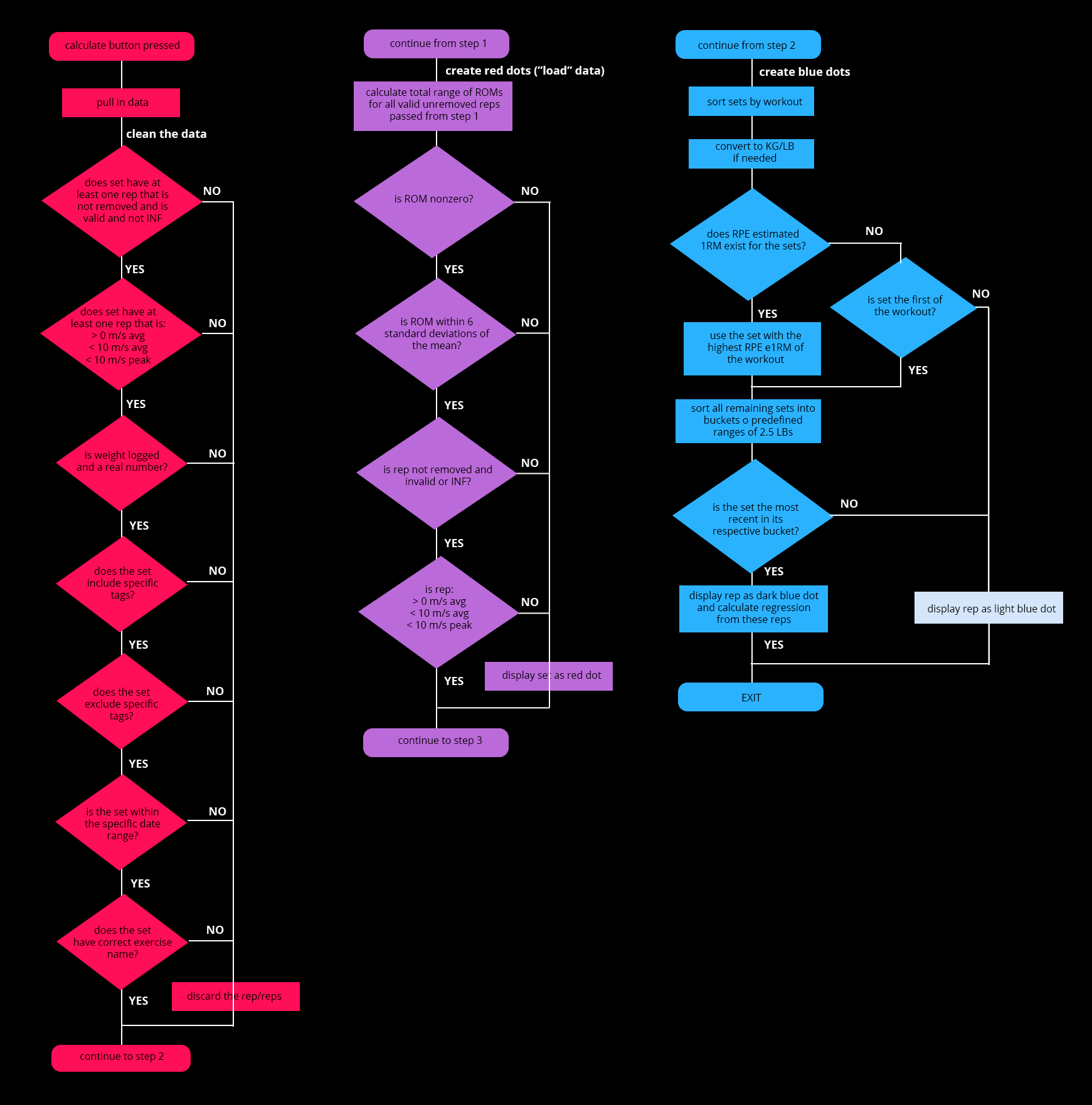
Step 1 (the pink flow chart) finds all relevant sets. Sets have to match the exercise name, tags, and date range. They also need weights filled in and require at least one valid rep.
Step 2 (the purple flow chart) finds bad set data and ignores them. Sets with Range of Motions outside an expected range and impossible velocities are pulled out. In the case of ROMs, anything greater than 6 standard deviations of the mean ROM or less than 6 standard deviations of the mean ROM are considered incorrect. With velocities, average and peak velocities are expected to be less than 10m/s and to be greater than 0. Sets that are marked this way show as red dots on your chart.
Step 3 (the blue flow chart) thins out sets to ones that are most relevant. First, we thin per workout. For each unique weight of every workout, we select the set that either has the highest RPE 1RM (calculated using the set’s fastest rep and RTS’s RPE charts) or the first set. Next, we thin based on weight. All sets are sorted into buckets of 2.5 lbs, so both 84.5lbs and 86lbs would be in the 85lb bucket. The latest set from each bucket are what’s used in your linear regression and show up as dark blue dots on your chart, with light blue representing the sets that were thinned out.
If you continue to get a message about low r², take a look at How do I get the best results?
